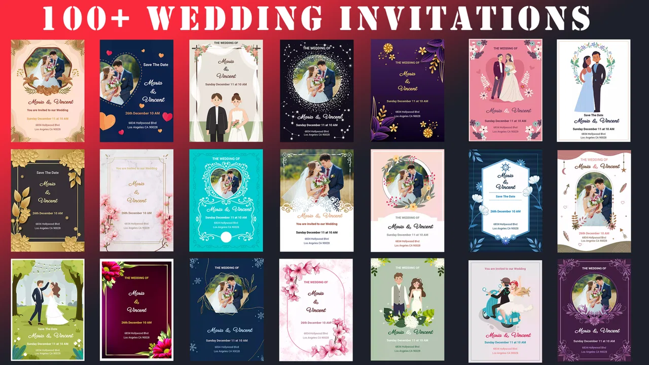
Wedding Invitation Card Maker
- 4.5
- Rating
- 1.00M
- Installs
- Free
- Price

 Analysis by App-foxy
Making a wedding card sounds simple until the wording is ready, the photos are chosen, and the final design still feels slightly wrong. I tried Wedding Invitation Card Maker with that practical problem in mind: not as a replacement for a professional designer, but as a quick way to turn an idea into a shareable invitation or anniversary card. It is a free events app from Galaxy studio apps, aimed at people who want to work from a phone rather than start with a blank design program.
My first impression was that its appeal is speed. You do not need to build every visual element from scratch, and the app is easier to approach than a full desktop design tool. That matters when a couple needs a digital invitation for a family group, or when someone remembers an anniversary at the last minute and wants something more personal than a plain message. The trade-off is that convenience depends on how well your chosen text, images, and layout fit together.
The app has an average rating of 4.5 from around 17 thousand ratings, and it has passed over a million installs. Those numbers suggest that the basic idea works for a broad audience, although popularity does not remove the need to check your finished card carefully. A template can make a design look polished while still leaving a name, date, or line of text that needs editing.
You May Also Like

 Blood Strike: 2.5 Anniversary
Blood Strike’s Loadouts Turn Every Drop Into a Tactical Gamble
A close look at Blood Strike’s custom loadouts: how fast access to signature weapons reshapes its battle royale rhythm, rewards preparation, and narrows the gap between fights.

 Pandora - Music & Podcasts
Pandora’s Music Is Easy to Start, but Harder to Recover
Pandora’s strength is its low-effort path from a seed to a station. Its weak spot is how much confidence it asks you to place in connection, setup, and quiet recovery.

 8 Ball Pool
 Is Built on Rivalries, Rematches, and Routine
A close look at the rivalries, rematches, shared routines, and unanswered safety questions that turn a quick pool match into a persistent mobile community.

 Samsung Music
’s Quiet Strength Is Playing What You Already Own
Its reach comes less from spectacle than from dependable access to a personal library. That simplicity is both the app’s strongest retention engine and its ceiling.

 AccuWeather: Weather Radar
AccuWeather Review: A Quick, Clear Forecast for Everyday Decisions
For everyday plans, the best forecast is the one you can understand quickly. AccuWeather makes rain timing, radar, and local conditions easy to act on, with a few trade-offs.

 Hill Climb Racing
Why Hill Climb Racing Still Turns Crashes Into One More Run
A tiny car, a bumpy hill and one more upgrade: Hill Climb Racing keeps resurfacing because its simple chaos makes every near-miss feel personal.
More From Our News Desk



Getting from a blank idea to a usable wedding card
I find the easiest way to make a card feel personal is to decide on its one main job before choosing a design: invite guests, or mark a shared milestone. That focus helps me judge whether the wording and image belong together, rather than polishing details that do not serve the message. Next, I look at how a few small choices affect the finished card’s clarity.
Where people usually get stuck
The hardest part is rarely opening the editor. It is deciding what the card is supposed to do. A wedding invitation needs clear practical information, while an anniversary card can focus more on mood and personal wording. If you treat both as the same project, you may spend time adjusting decorations before deciding whether the message is actually readable.
I recommend preparing the essentials before choosing a design: the couple’s names, the event date, the location or meeting details, and the wording you want guests to read first. For an anniversary card, prepare the short message separately. This small step prevents a common problem in card-making apps: choosing an attractive layout and then forcing a long paragraph into a space designed for a few lines.
Another point of friction is visual balance. Decorative backgrounds, elegant lettering, and photographs can compete with one another. In my experience, the most useful approach is to decide which element carries the message. If the photo is the focus, keep the wording short. If the invitation details matter most, choose a calmer image or background so the information remains easy to scan.
People also get stuck when they expect every template to suit every event. A romantic wedding invitation and a milestone anniversary card may need different levels of formality. I would not judge a design only by its preview. Read the actual text at normal phone size, especially if the card will be sent through a messaging app where recipients may view it on a smaller screen.
Setup checks that prevent avoidable frustration
Before doing serious editing, I would make sure the phone is running Android 8.0 or newer. The current version is 3.1.1.1, so keeping the app updated is sensible when an older installation behaves unexpectedly. I also prefer to begin with a stable internet connection, particularly when opening a new design or preparing to share the result. That does not guarantee every issue disappears, but it removes one common source of interrupted loading.
Start with a small test project rather than your final invitation. Add a short name and a brief message, inspect the preview, and see how the editor handles your text. This reveals whether the selected layout gives you enough room before you spend time choosing photos and refining the wording.
Images deserve a little preparation. A bright, tightly cropped portrait usually works better than a distant group photo with important faces near the edge. If the original picture is dark or cluttered, changing templates may not solve the problem. Pick the clearest source image first, then choose a design that supports it instead of expecting the app to rescue a weak photo.
I would also keep the first version simple. Use one main image, a short heading, and only the information guests need. Once that version looks correct, you can experiment with extra decoration. This workflow makes it easier to identify whether a problem comes from the image, the wording, or the design itself.
Because the app is free to install, it is easy to try without committing money at the start. However, in-app purchases range from $0.99 to $99.99 per item. I would pay attention to any purchase prompt and decide whether the available free workflow already meets the need. For a one-off invitation, spending should be based on a specific improvement you can recognize, not on the assumption that a paid option will automatically make the card better.
A workflow that is easier to recover when something goes wrong
My preferred process is deliberately repetitive in a useful way. First, select the general occasion: wedding invitation or anniversary greeting. Next, choose a layout that matches the amount of text you have. Then add the wording, place the most important details where they are easy to find, and only afterward adjust the image and decorative elements.
When a result looks crowded, I would not immediately start changing every setting. Remove one line of text and check the preview again. If the card improves, the issue was probably content density rather than the template. If it still feels unbalanced, try a different layout before editing the message further. This saves time and protects the wording you actually want to send.
A useful recovery trick is to keep a plain-text copy of the invitation outside the app. If you accidentally replace a name or date while experimenting, you can restore the wording without trying to remember it. I would also save a clean version before making decorative changes. That gives you a reliable fallback when a more ambitious edit makes the card less readable.
If the editor appears stuck, I would first wait briefly, return to the previous screen, and reopen the project rather than repeatedly tapping the same control. If that does not help, the basic checks are familiar ones: close other demanding apps, restart the phone, confirm there is enough free storage, and reopen the project. These steps are general rather than app-specific, but they are safer than deleting a project immediately.
When an image does not appear correctly, I would test another photo before assuming the whole design is broken. A different file may reveal whether the problem is tied to that particular image. Likewise, if text seems to disappear, shorten it temporarily. If the shorter version displays, the layout may simply have limited space for the original wording.
When the app is not the real cause
Not every disappointing card is an editing failure. Sometimes the invitation is trying to communicate too much. Directions, dress guidance, a long personal message, several photographs, and decorative phrases can turn a small digital card into a crowded notice. In that situation, I would use the card for the essential invitation and send extra details separately.
Sharing can also create misleading results. A design that looks sharp in the editor may appear smaller or softer after being passed through a messaging service. Before sending it to every guest, share it with one trusted person and ask them to read the names, date, time, and location on their own phone. This is a practical quality check, not just a cosmetic one.
Color is another frequent source of confusion. A romantic palette may look attractive on one screen but reduce contrast on another. I would prioritize readable lettering over matching every decorative shade. For older relatives or guests who use smaller displays, a clear high-contrast card is more considerate than a delicate design that requires zooming.
There is also a difference between a digital greeting and a print-ready invitation. This app is a sensible choice when the finished card will be viewed on phones or shared online. If you need exact paper dimensions, professional bleed settings, coordinated stationery, or a printer-ready production file, a dedicated design service is likely the better tool. The app’s convenience is strongest when the destination is digital and the turnaround needs to be quick.
Everyday uses beyond the obvious invitation
A realistic example would be a couple finalizing a small ceremony in the evening. One person has the venue details in a message, the other has a favorite photo, and relatives are waiting for something they can forward. I would create a short first version with the names, date, location, and a clear request to confirm attendance. After checking it on a second phone, I would send that version rather than delaying the invitation while trying to make it elaborate.
The same approach works for an anniversary. Instead of filling the card with a long history, use one meaningful photo and a message that sounds like the sender. A short, specific sentence usually feels more personal than several generic romantic lines. The app is useful here because it gives a visual form to a message that might otherwise be sent as plain text.
Family members can also use it when they are helping with wedding preparations but are not comfortable with advanced design software. The simpler learning curve is an advantage, especially if the goal is to produce one attractive card rather than develop a complete visual identity. I would still ask someone else to proofread the final version, because ease of design does not replace a second pair of eyes.
For repeated professional work, my view is more cautious. A wedding planner, photographer, or event business may need consistent branding, reusable layouts, and precise control over output. A general card-making app may be too limiting for that workflow. It is better suited to personal projects where speed and accessibility matter more than production control.
What the app does well, and where I would choose something else
The strongest part of the experience is the focused purpose. You are not entering a broad design system filled with unrelated poster, presentation, and social media tools. The app is built around wedding invitations and anniversary cards, which helps keep the task understandable. For someone who wants a fast result on Android, that focus is more useful than a large collection of professional controls they may never touch.
Its free availability also lowers the barrier to testing a few approaches. The Everyone content rating makes it appropriate for general household use, including relatives who may be helping prepare the card. Galaxy studio apps has kept the concept straightforward enough for casual users, although the final quality still depends heavily on the choices you make inside the editor.
The limitations become clearer when you want detailed control. I would not choose it for complex typography, carefully measured print layouts, or a multi-page wedding suite. I would also skip it if your priority is a highly distinctive design that does not resemble familiar invitation styles. A general-purpose design app may be better when you need extensive customization, while a professional tool is preferable for exact printing requirements.
There is a practical trade-off around purchases as well. Since the app is free but offers optional items, cautious users should inspect what is available before building an entire design around an element they may not want to buy. My advice is to create a complete card using the options you are comfortable with, then consider an optional purchase only if it solves a clear problem such as a missing visual style.
My practical verdict after using it
I see Wedding Invitation Card Maker as a useful Android option for quick digital wedding invitations and anniversary greetings. It is most convincing when you have a clear message, one good photo, and a need to share the result without learning a full design program. Its value is not that it removes every decision; it is that it makes the first workable version easier to reach.
I would recommend it to couples preparing a simple online invitation, relatives making a personal anniversary card, and anyone who prefers editing on a phone. I would be more reserved for users who need print precision, extensive brand control, or a design that must be built from highly specific components. In those cases, another design tool will probably justify its extra complexity.
The best results come from treating the app as a focused composition tool rather than a substitute for planning. Write the essential details first, test the layout with short text, check the final card on another phone, and keep a backup of the wording. Those habits address most of the friction I encountered and make the free starting point genuinely useful.
For its intended audience, the app earns a place among practical event tools. It is not the right answer for every invitation, but for a fast, personal, phone-made card, I would happily suggest giving it a try. Choose clarity before decoration, and the finished invitation will feel more thoughtful than a rushed template.
FAQs for Wedding Invitation Card Maker
01What features does the Wedding Invitation Card Maker app offer?
The Wedding Invitation Card Maker app provides a variety of features including customizable templates, a wide selection of fonts and colors, and the ability to add personal photos. Users can also incorporate digital stickers and embellishments to enhance their invitations. The app supports both digital and printable formats for convenient sharing.
02Is the Wedding Invitation Card Maker app user-friendly for beginners?
Yes, the app is designed with an intuitive interface, making it accessible for users with no prior design experience. It offers easy drag-and-drop functionality, step-by-step guides, and pre-designed templates that simplify the invitation creation process. Most users find it quick to navigate and easy to use.
03Can I share my wedding invitations directly from the app?
Absolutely. The Wedding Invitation Card Maker app allows users to save their creations in various formats, including JPEG and PDF. Users can share their invitations directly via email, social media platforms, or messaging apps. The app also supports printing options for those who prefer physical invitations.
04Does the app provide any customer support if I encounter issues?
Yes, the Wedding Invitation Card Maker app offers customer support through various channels. Users can access a help section within the app, which includes FAQs and troubleshooting tips. For more complex issues, users can reach out to the support team via email or live chat for personalized assistance.
05Are there any in-app purchases or subscriptions required?
The app offers a free version with basic features. However, for access to premium templates, exclusive design elements, and ad-free experience, users might opt for in-app purchases or a subscription model. It's advisable to review the app's pricing details in the app store to understand the available options.
Pros
- Easy-to-use interface for all skill levels.
- Wide variety of templates available.
- Customizable fonts and colors.
- Quick sharing to social media platforms.
- Supports high-resolution downloads.
Cons
- Limited free template options.
- Occasional in-app ads can be intrusive.
- Some features require premium access.
- No offline editing capabilities.
- Lacks integration with calendar apps.

Wedding Invitation Card Maker
Gallery